
Contempt (1963)

Contempt is the most colorful display.
Presentation:
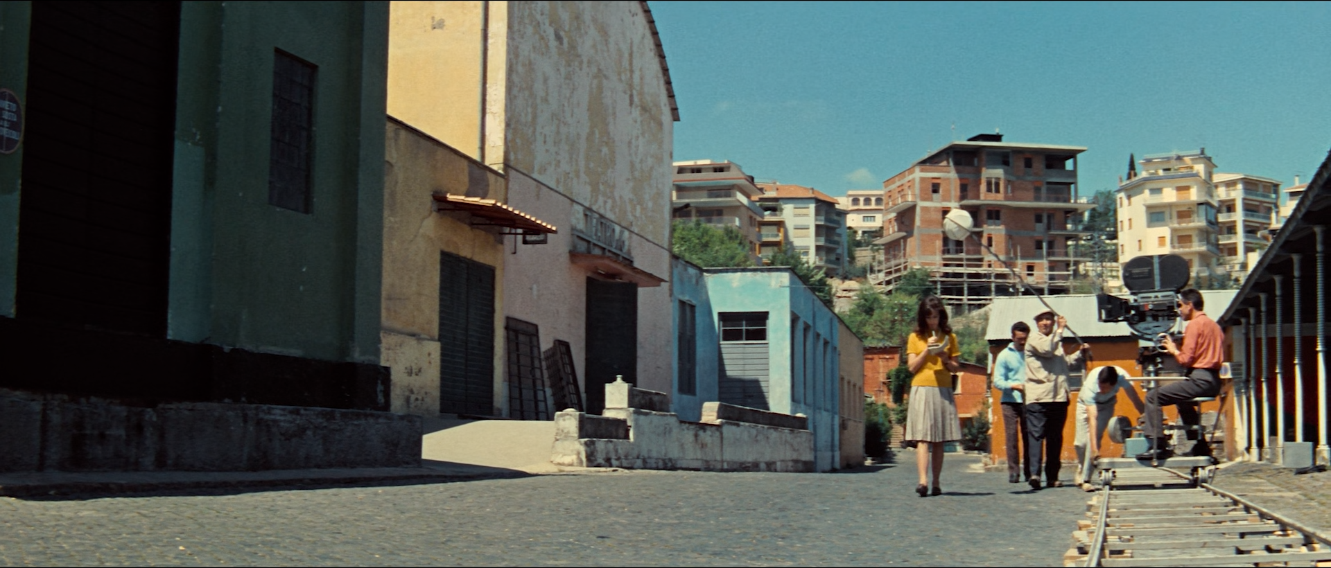
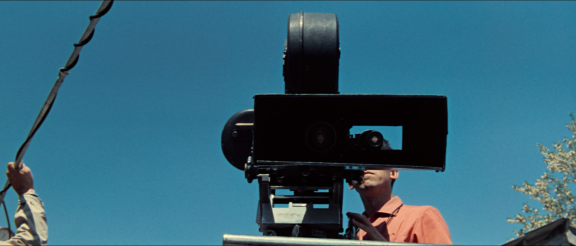
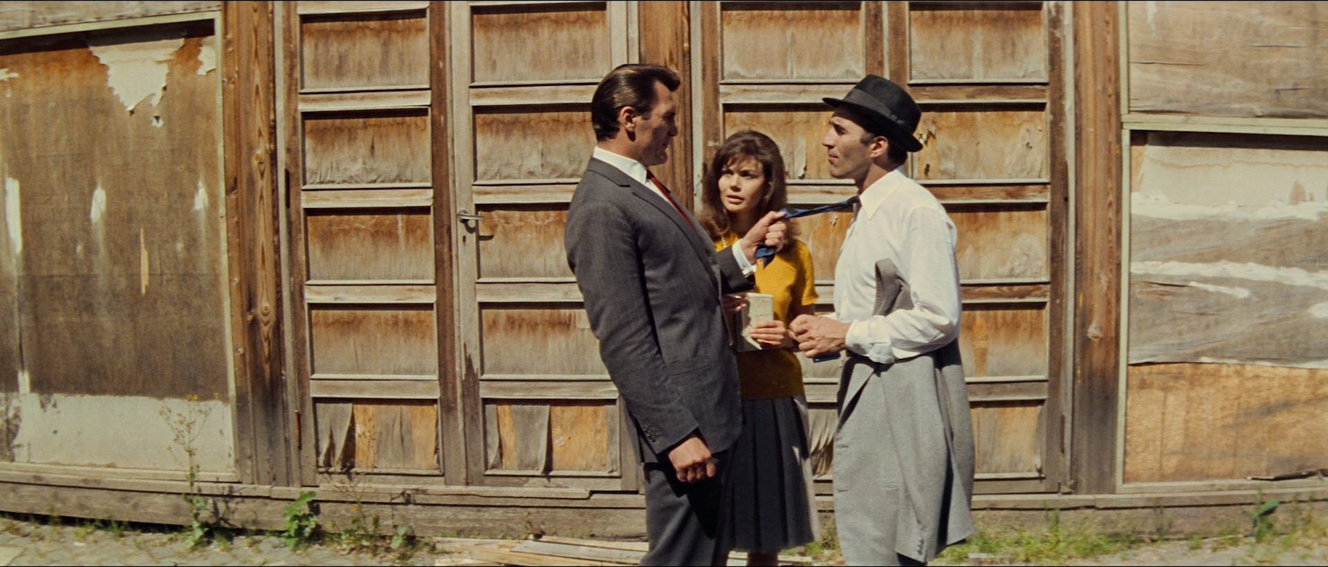
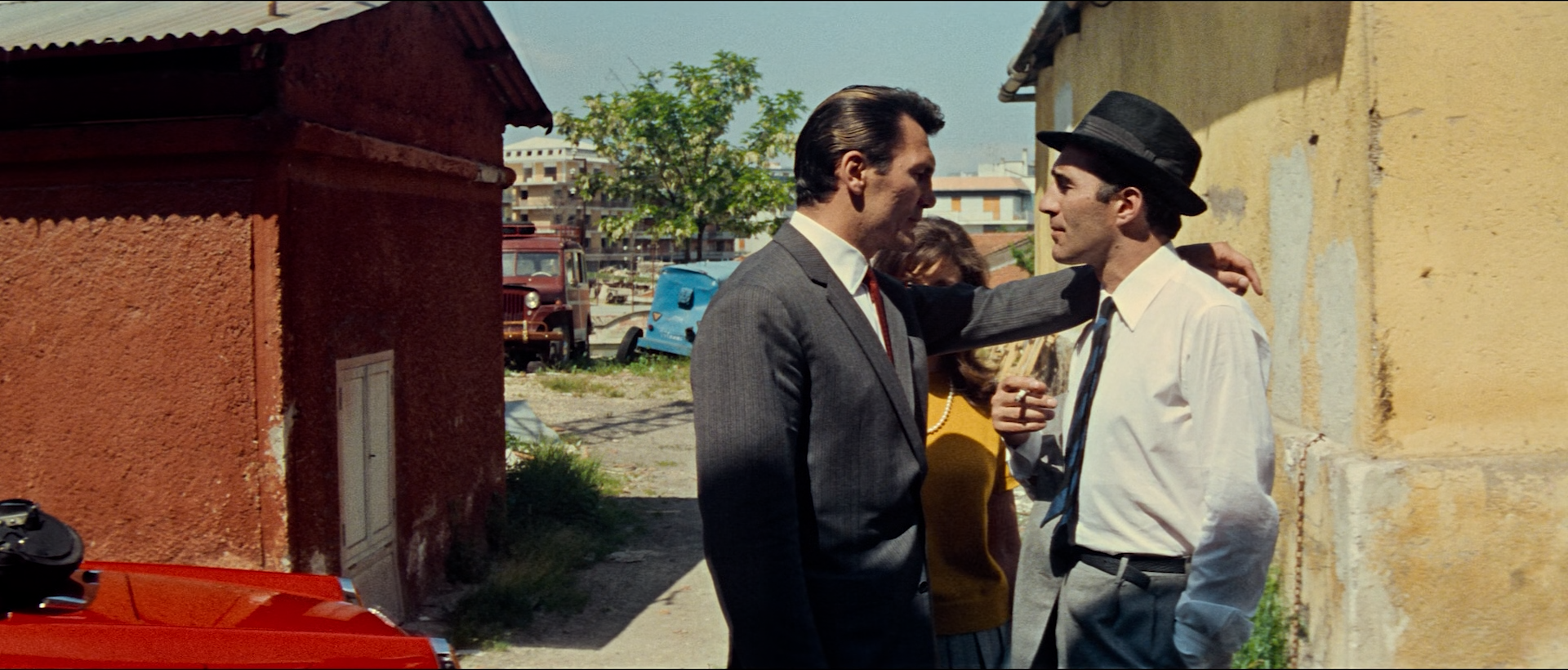
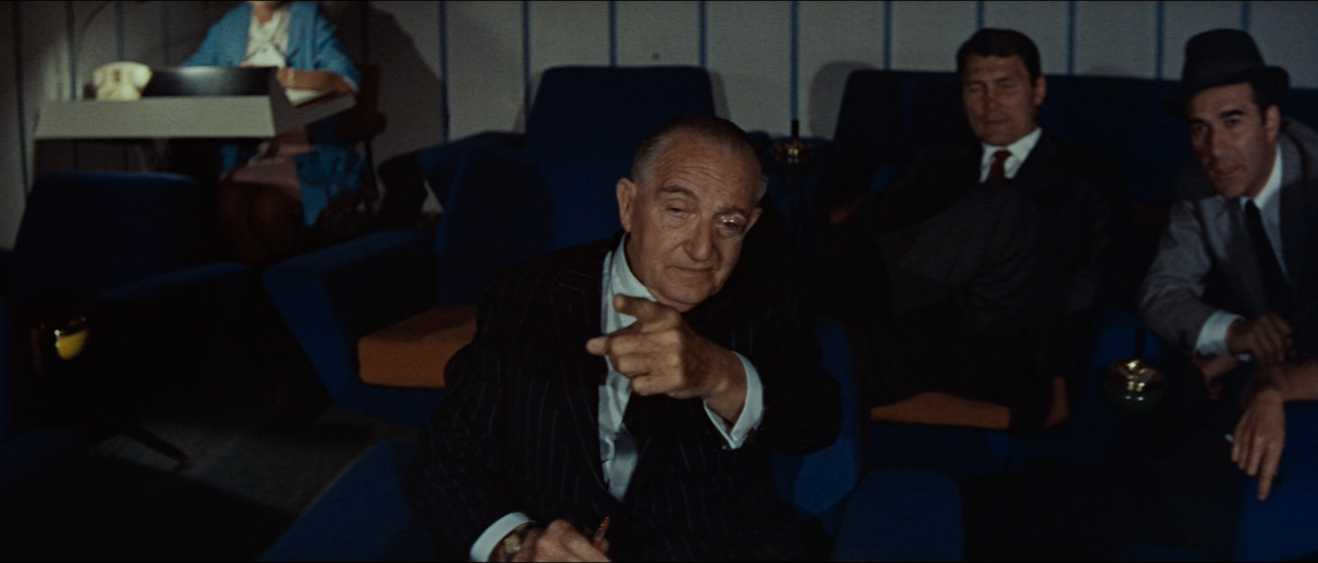
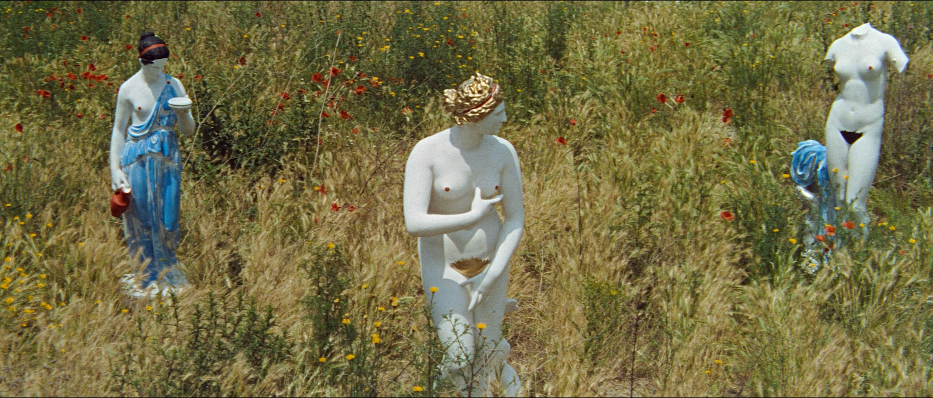
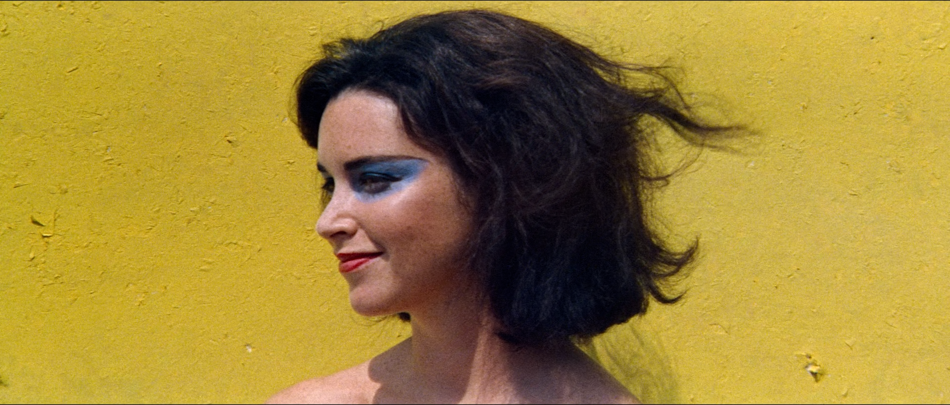
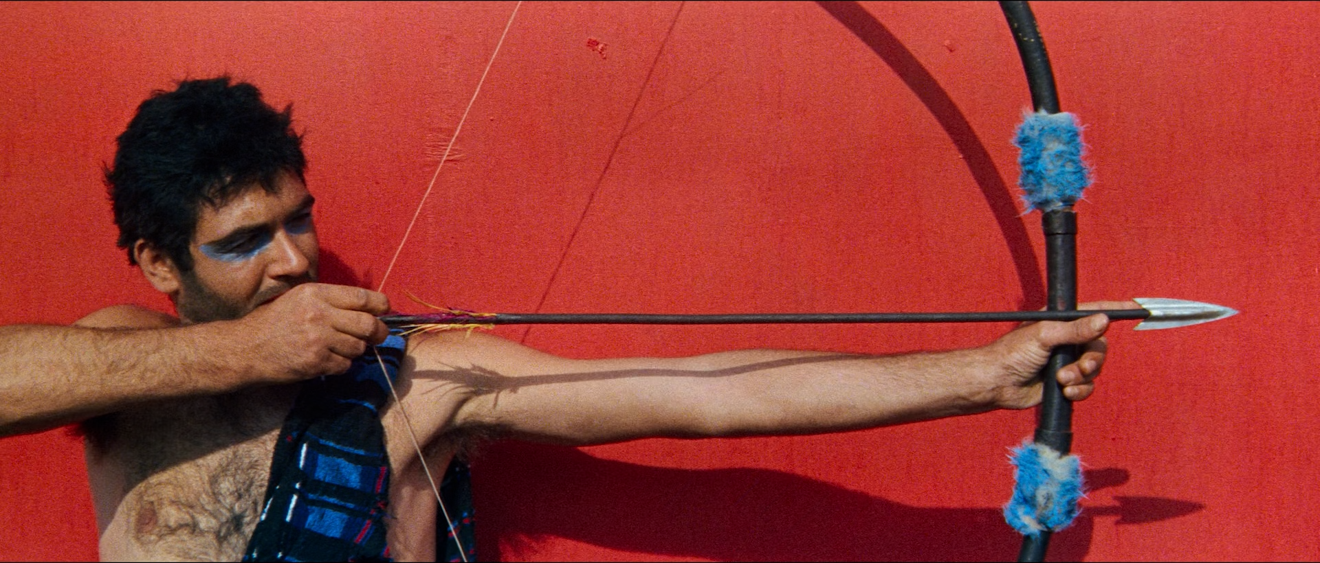
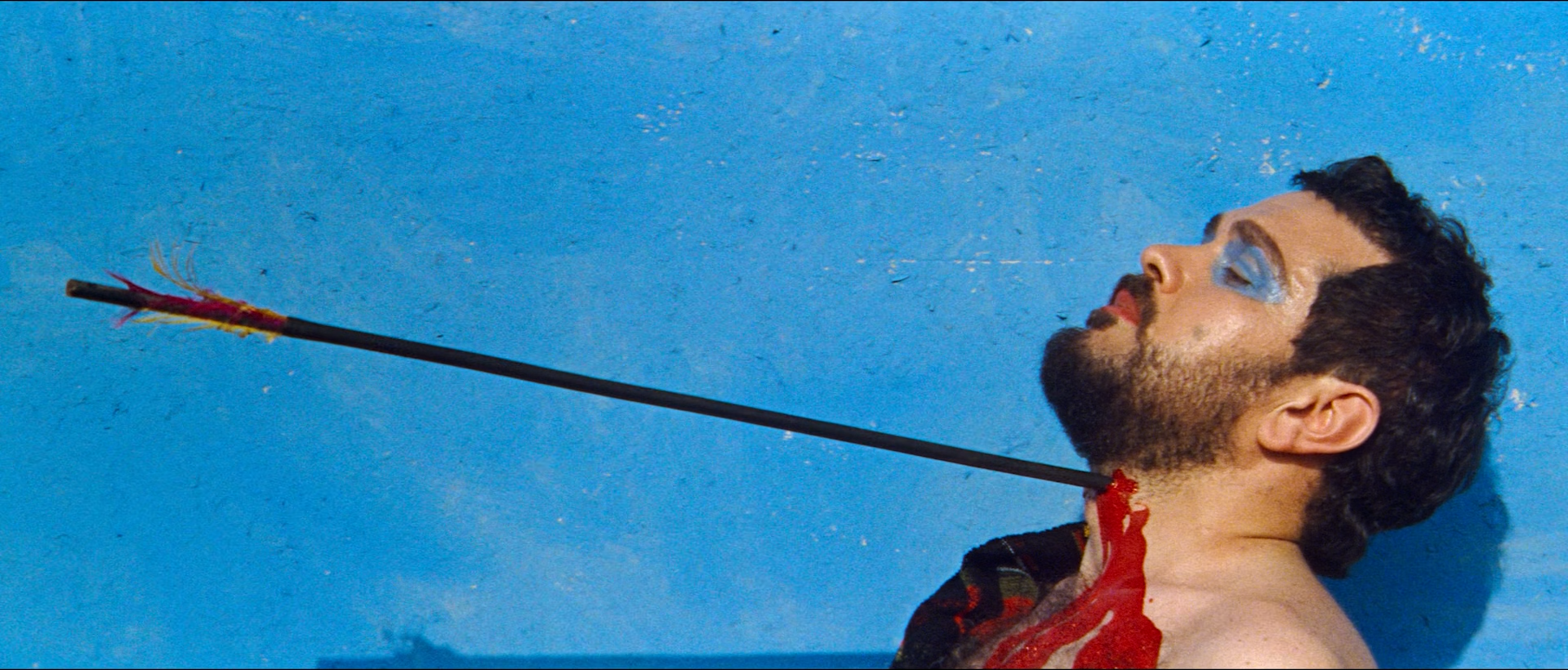
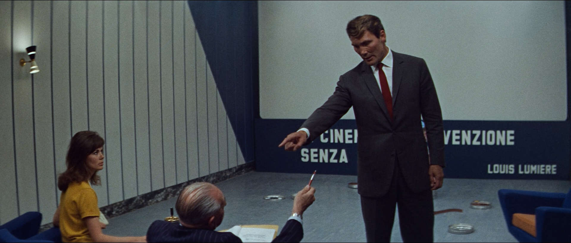
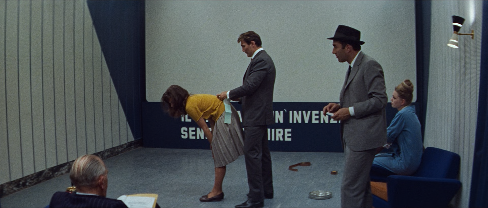
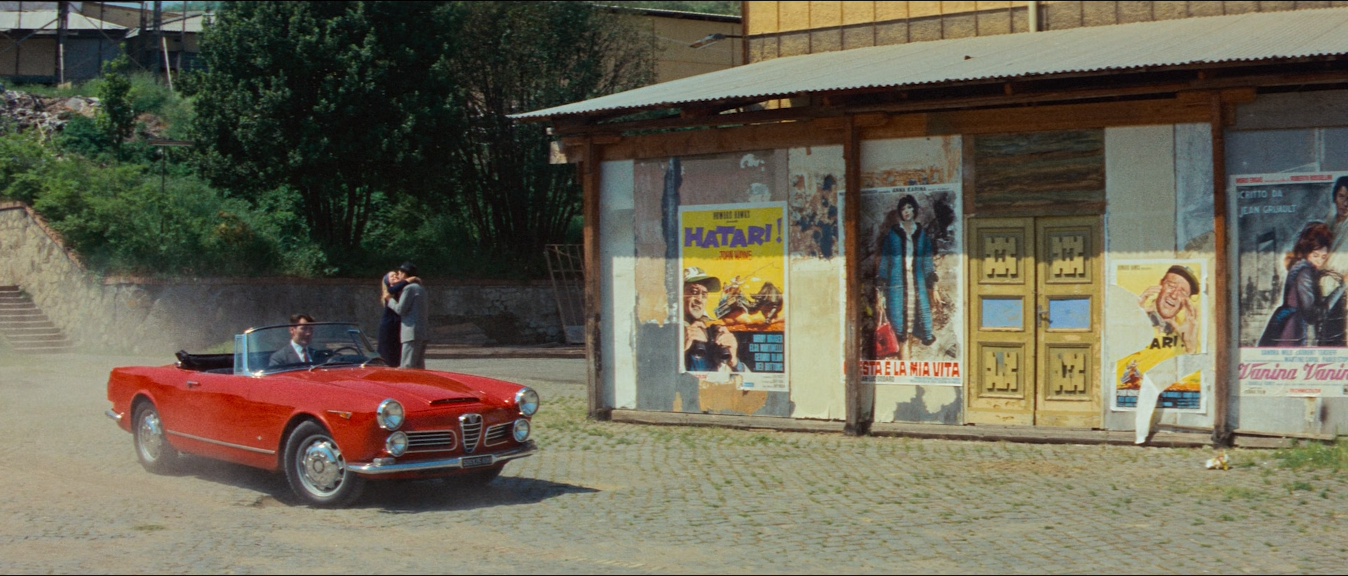
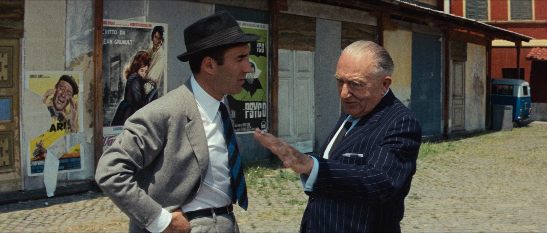
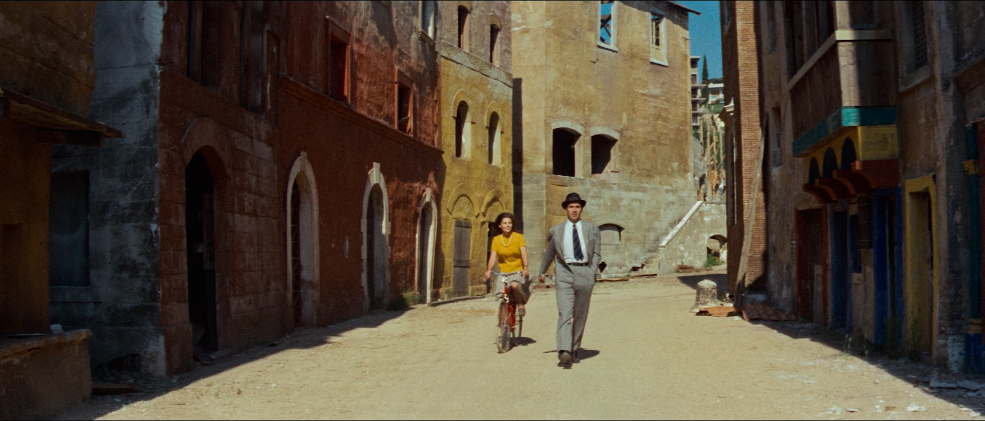
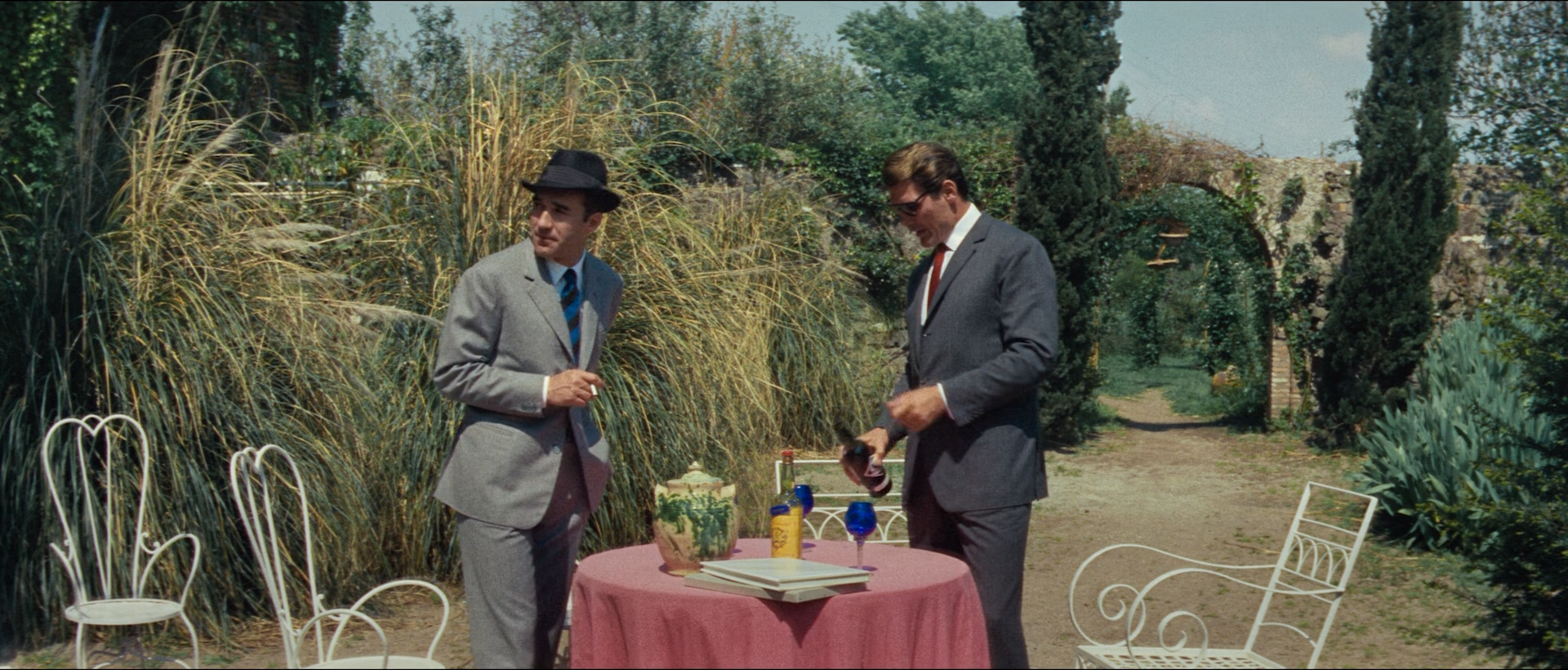
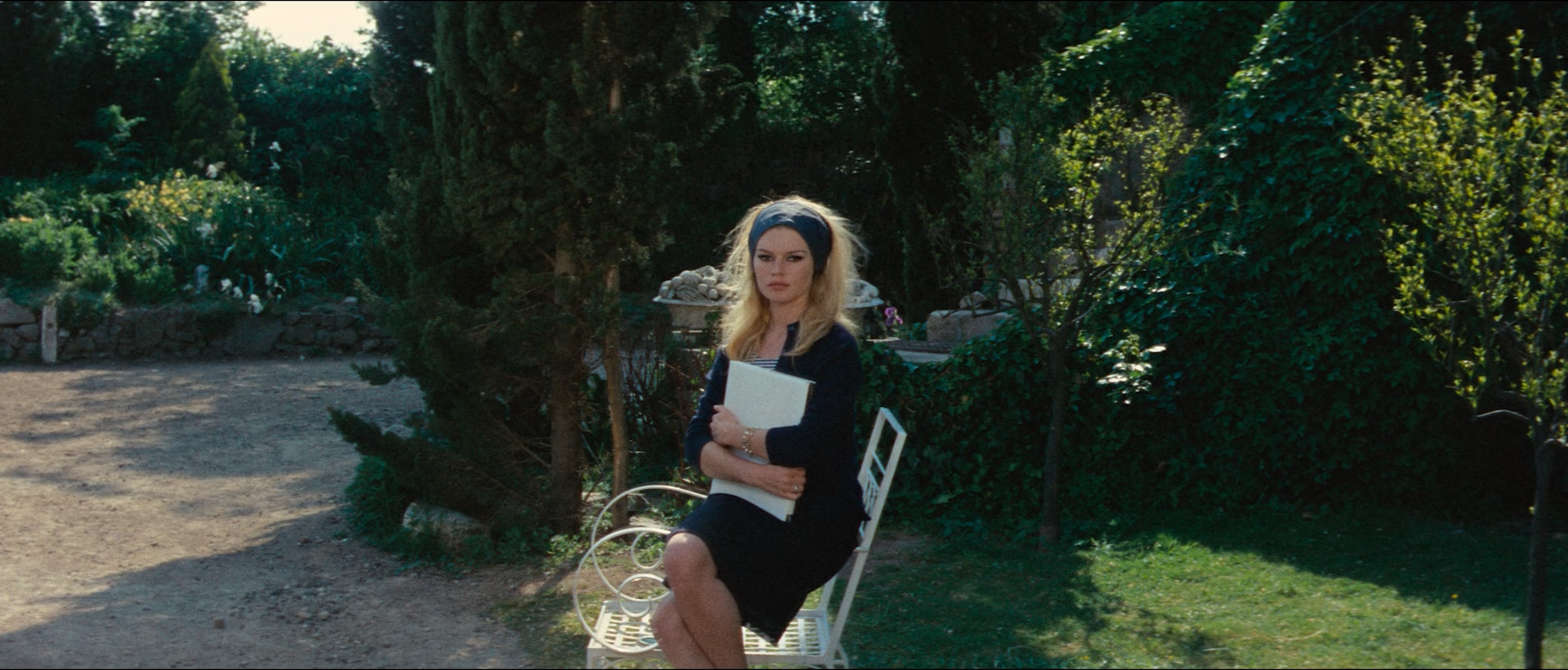
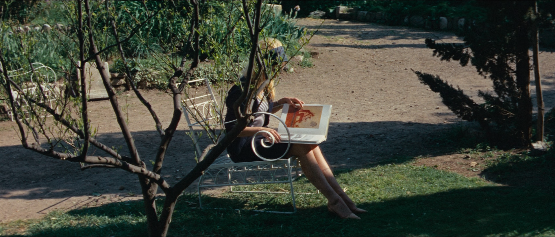
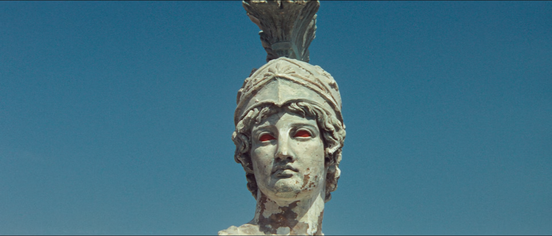
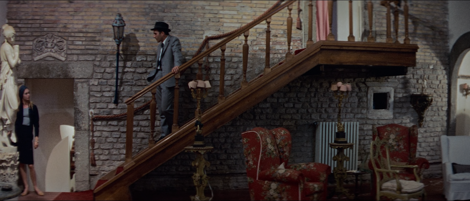
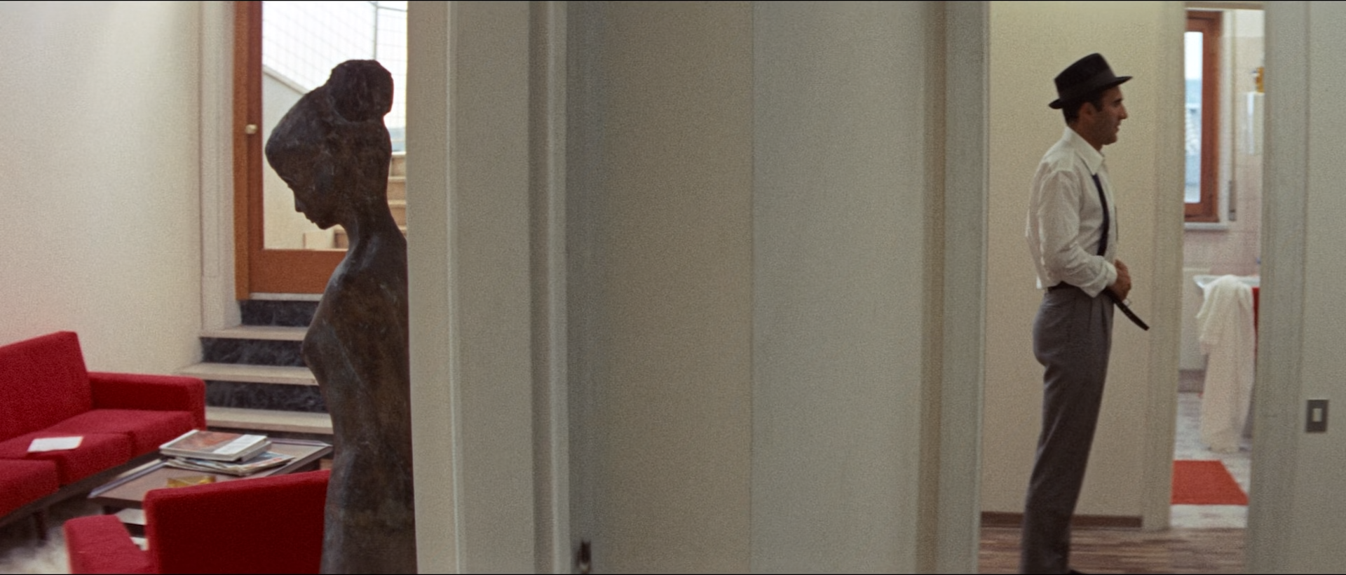
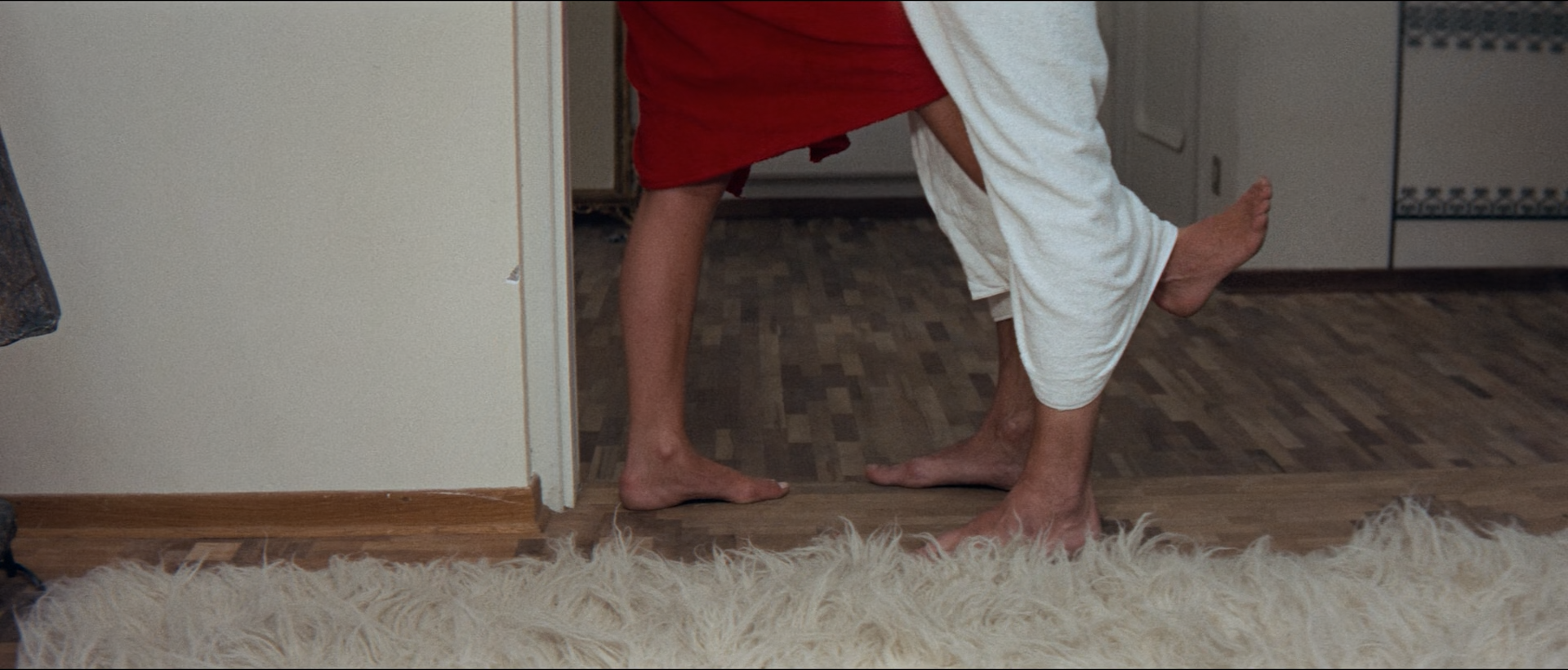
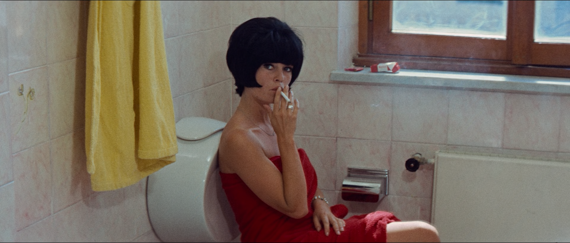
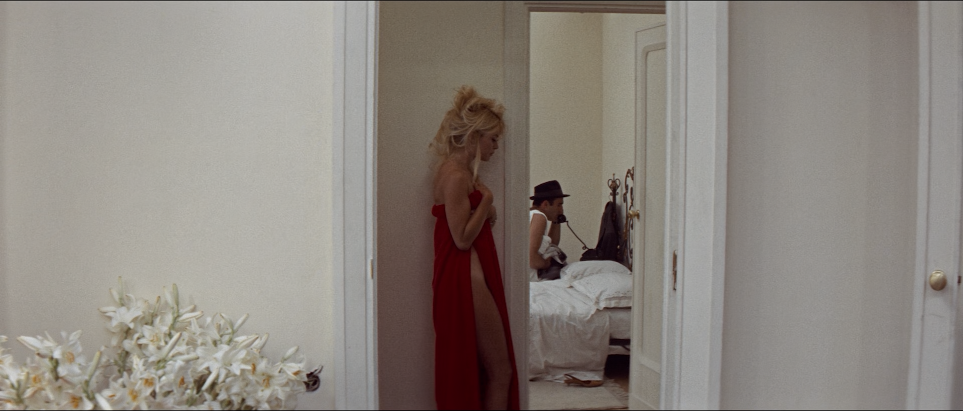
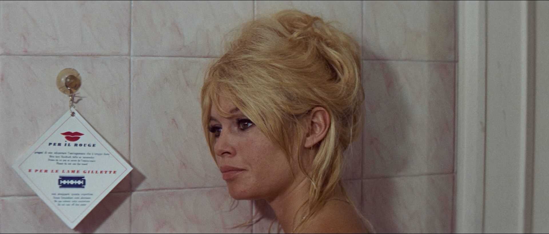
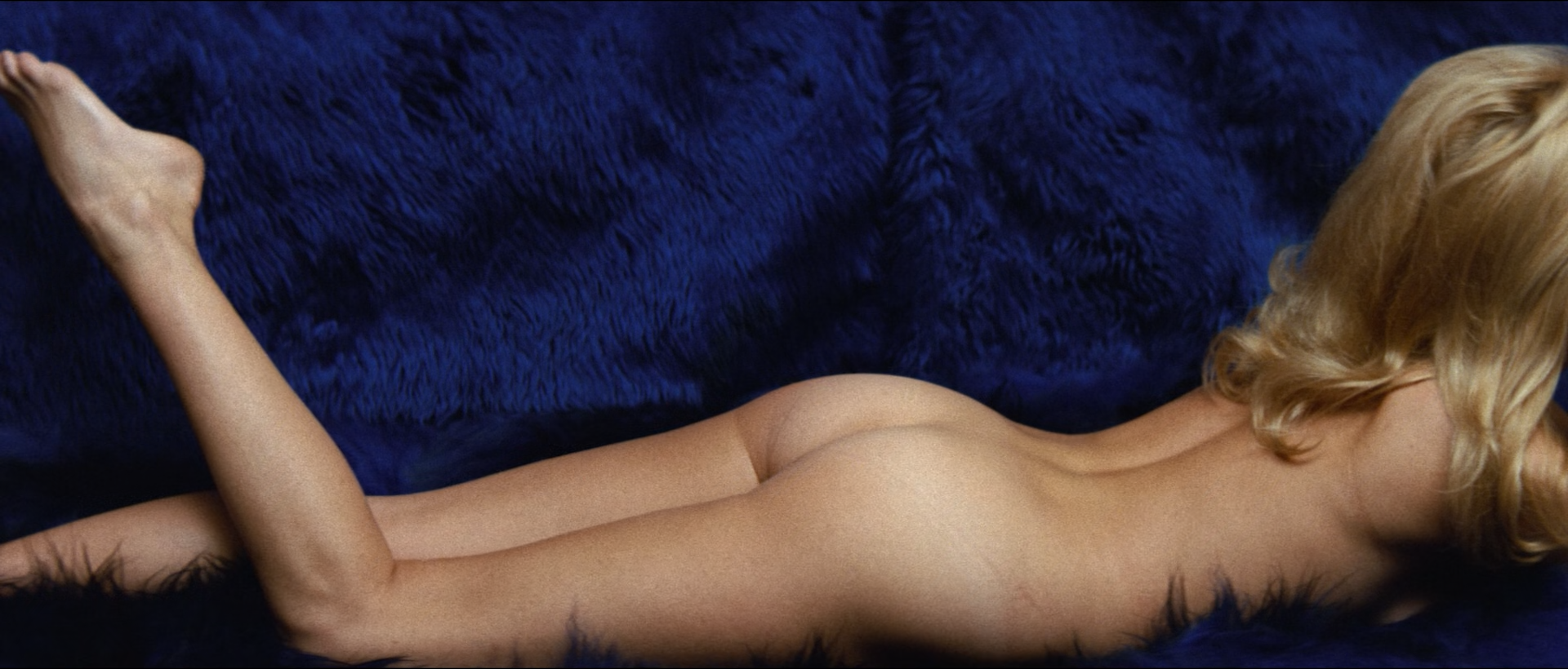
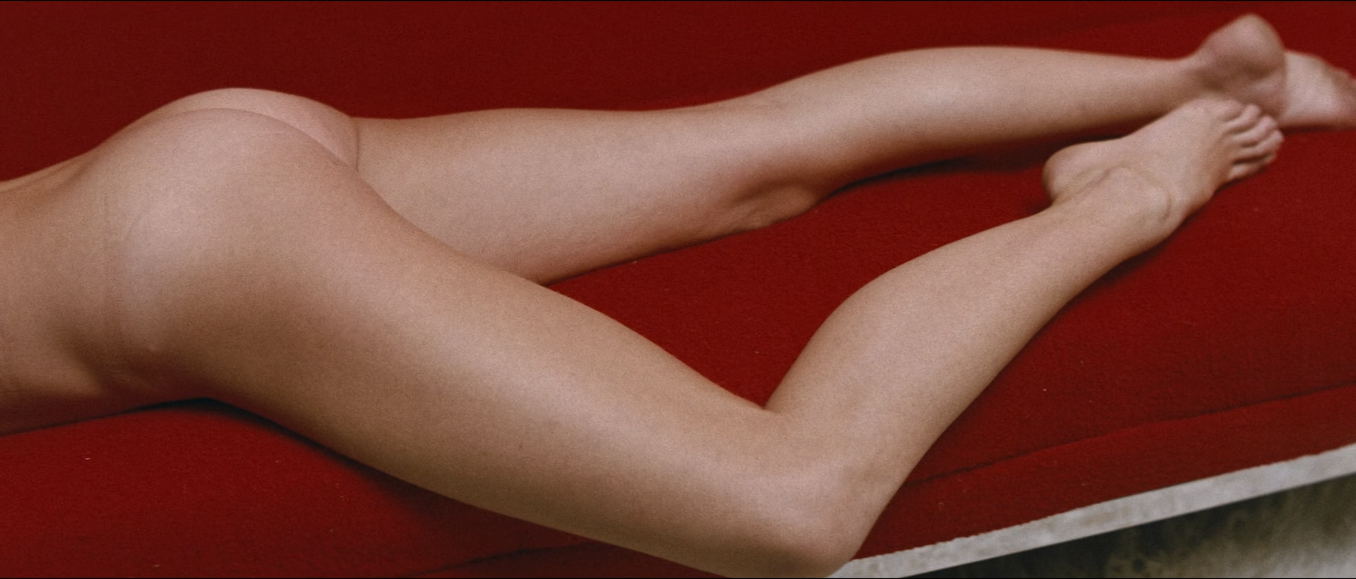
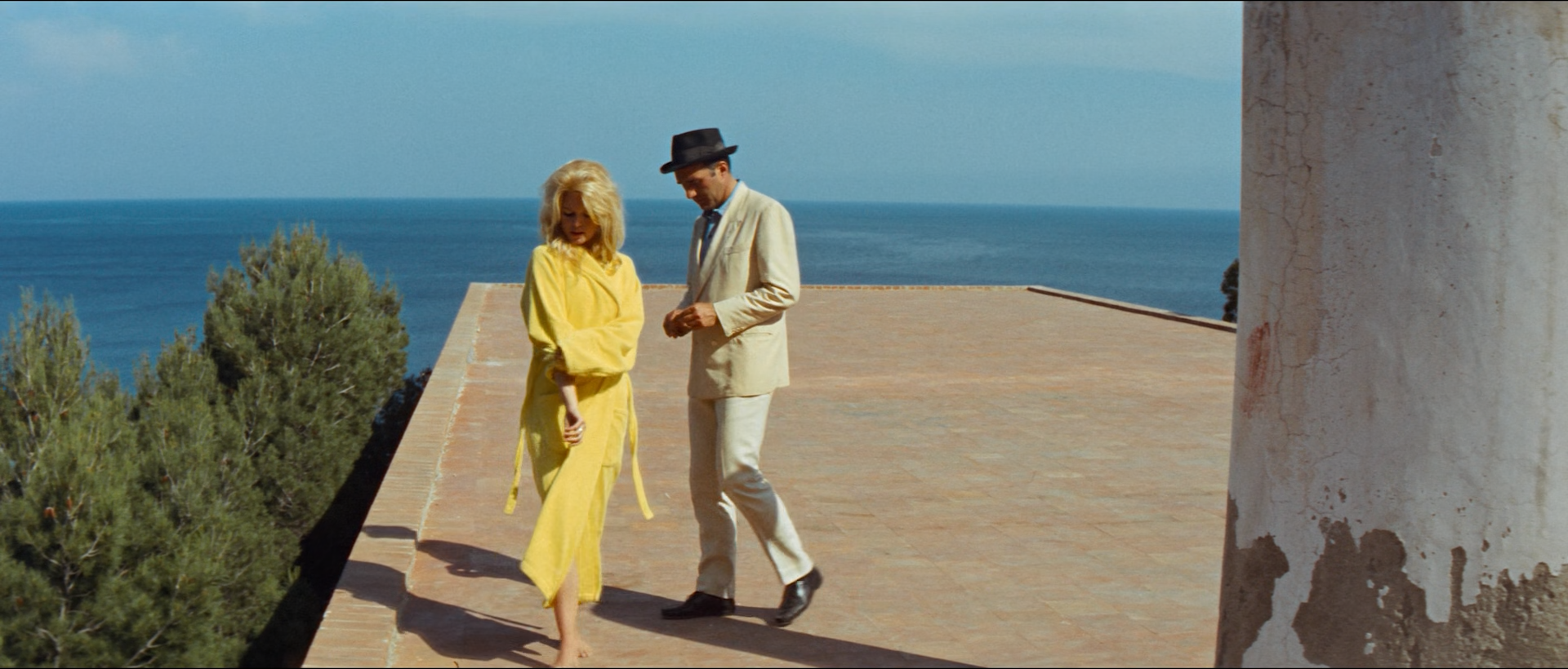
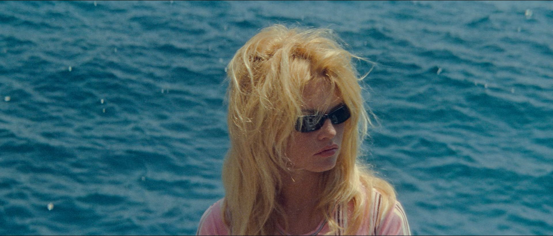
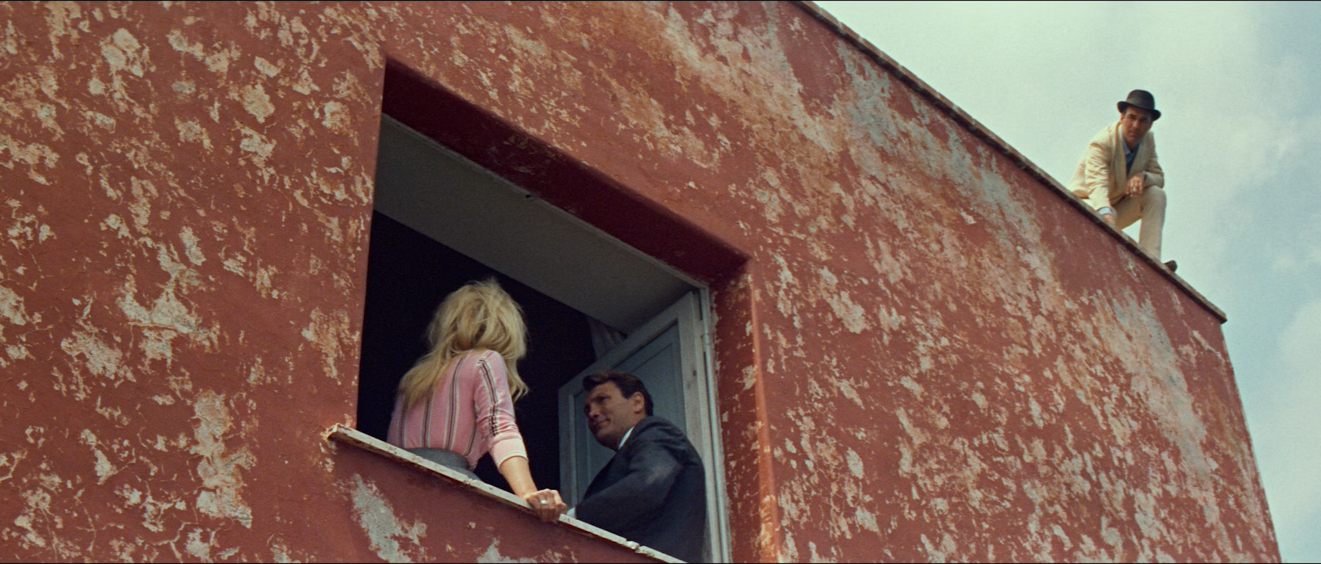
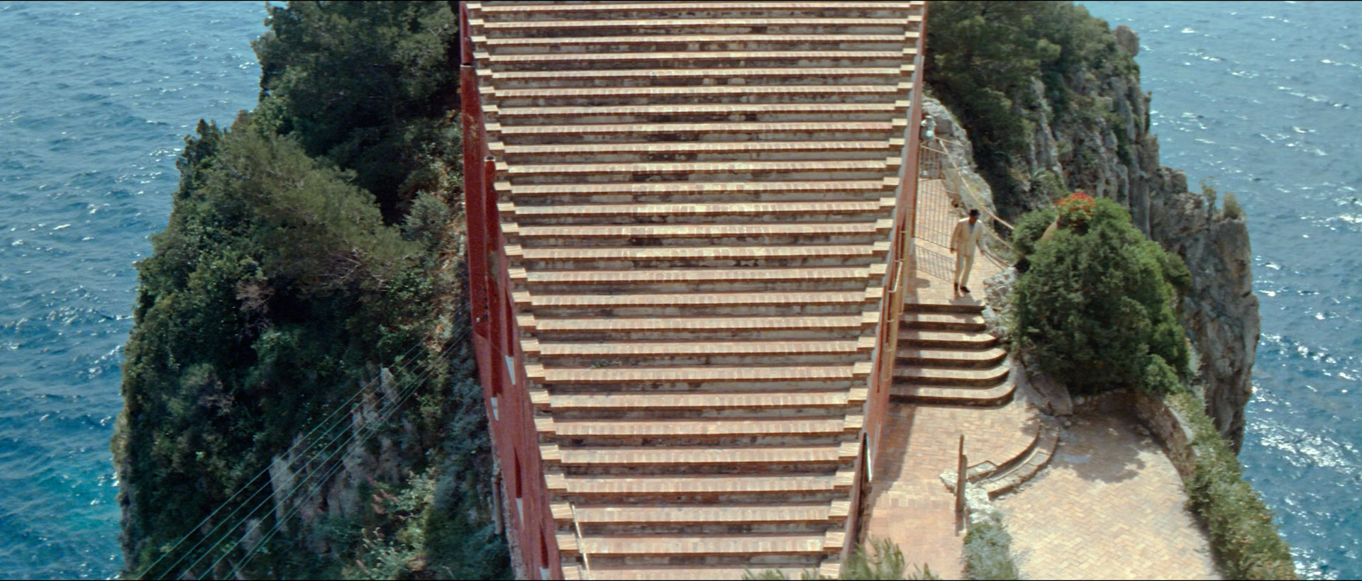
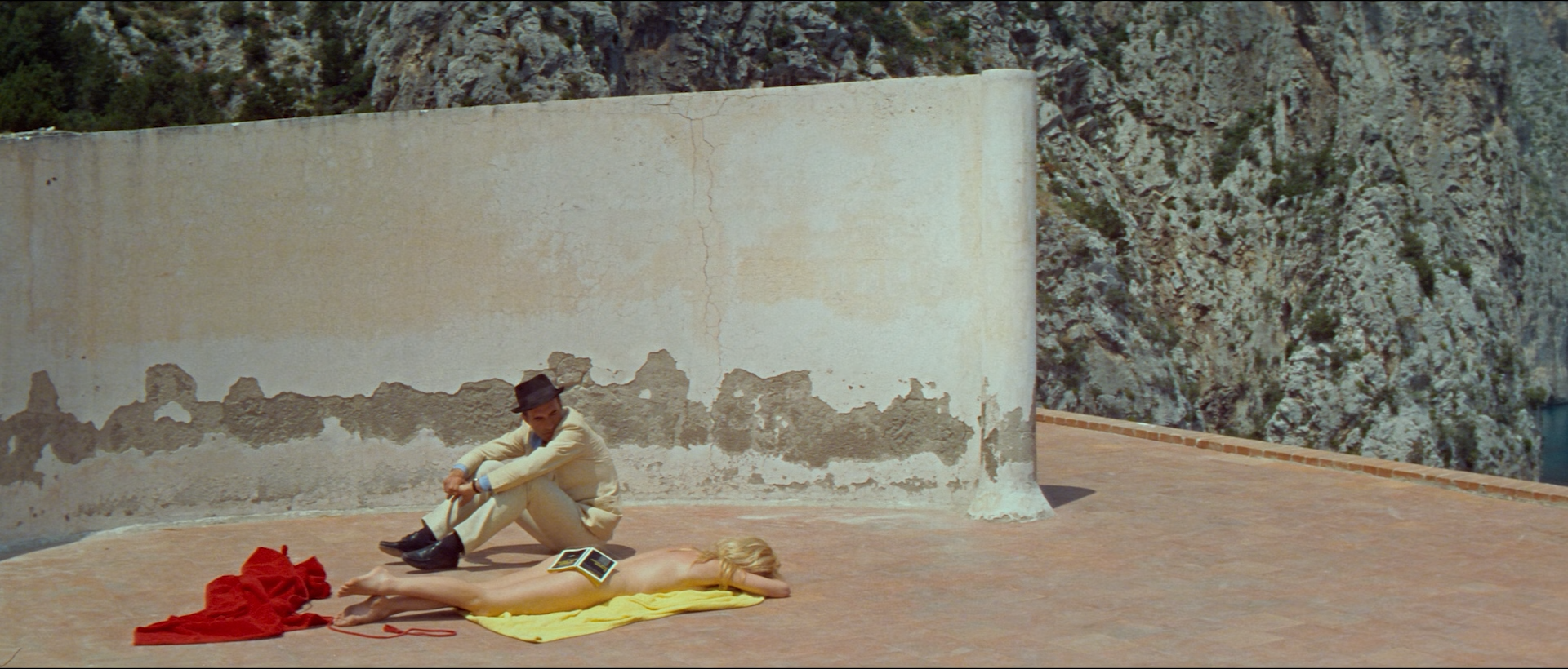
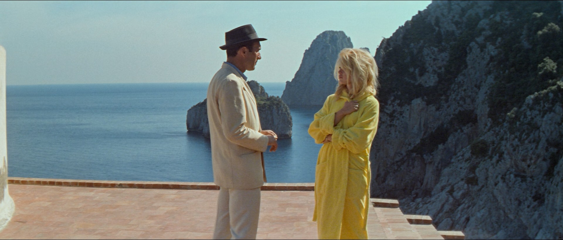
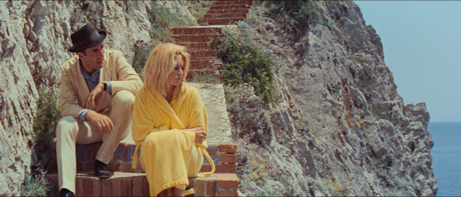
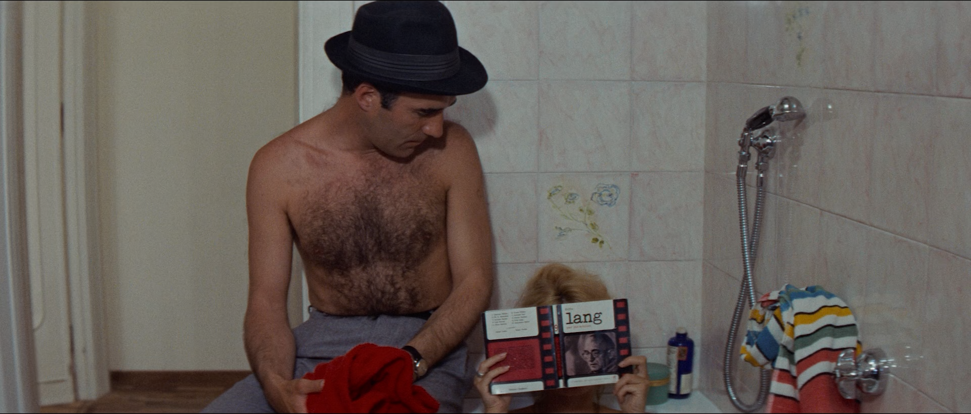
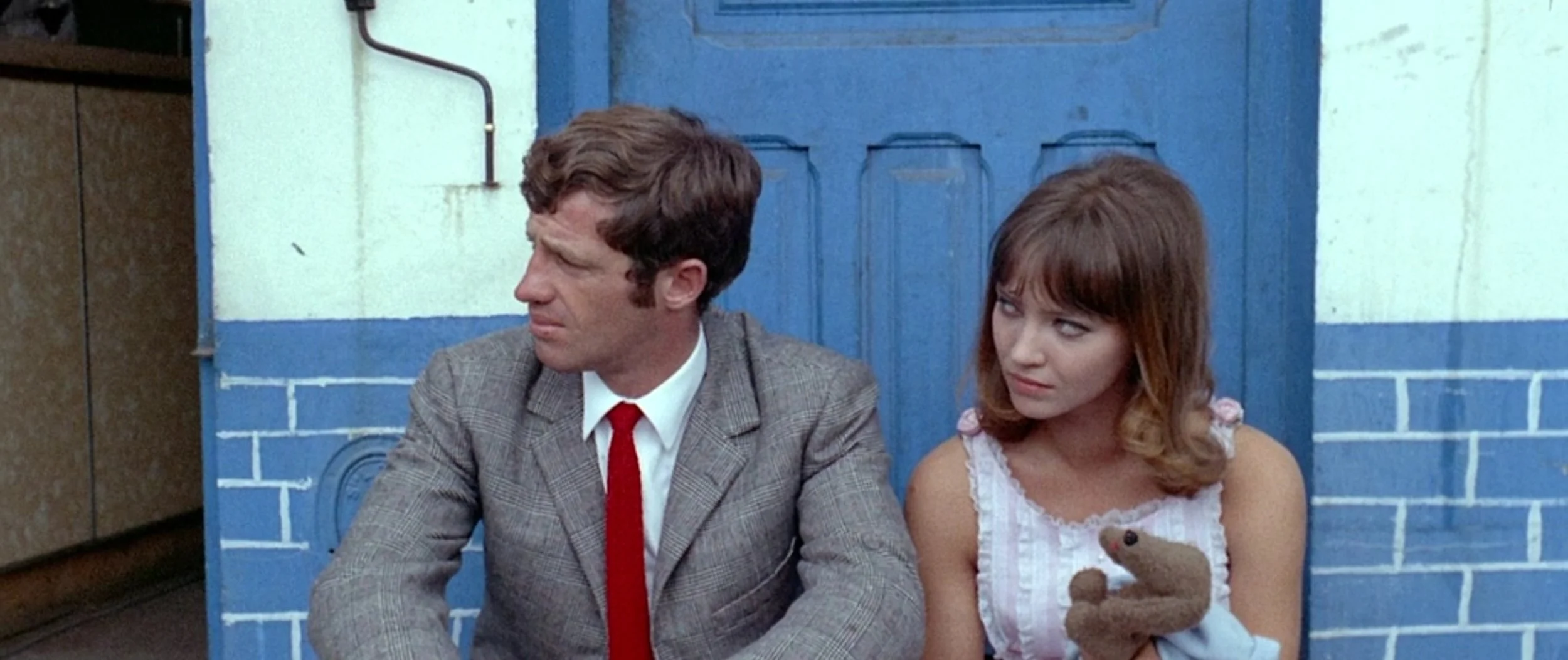
One of Martin Scorsese’s top recommendations for its use of color, French New Wave director Jean-Luc Godard crafts a visual collage of vibrant wardrobe and set design with red, blue and yellow. It’s pleasant to look at, but if that’s the reason you’re watching this film then I have to recommend you learn about color through set design from Pedro Almodovar. The color implemented in this film isn’t integrated with the story and is pure visual flair. It’s by no means shallow, but with the meandering dialogue and stream of conscious storytelling, some could feel that way. The plot is actually thematically substantial delving into the parallels of filmmaking and marriage, but Godard’s pretentious artistry makes it impossible for me to care about the characters at all. Honestly the best part of this film might be the fact that master director Fritz Lang cameos with a notable role in this film, and has probably influenced Scorsese to do the same.
Conclusion:
French and commercial filmmaking don’t usually go hand in hand, but this is as close as Godard probably got. I’m just not a big fan of his self-indulgent style, while impressive, is distracting and at the detriment of the story. No matter how talented of a auteur you are, you still have to hold the audience’s attention.
Recommendations


Contempt is the most colorful display.